VCU School of the Arts
Undergraduate Viewbook
Objective
The VCUarts Undergraduate Viewbook designed to offer a glimpse into the school’s creative energy, innovation, and all 16 departments and programs. Beyond outlining admissions and academic details, the book needed to spark an emotional connection to help students imagine themselves as part of the VCUarts community. This is where design played a pivotal role. The book wasn’t just packaging; it was the first impression. It had to be reflective of the school’s artistic spirit, immediately signaling to students that VCUarts is a place where creativity thrives.
Roles
Art Direction
Conceptualization
Visual Design
Press check
Deliverables
Viewbook
65,000 copies
Timeframe
2 weeks
Published July 2019


Concept
Rather than settling for a flat, static cover, I explored how design could create movement and depth. I went back to the simplest building block in art: the line. A line is more than a mark, it defines shapes, creates contours, and conveys movement. Using this foundation, I aimed to transform a flat surface into something dynamic that captures attention and engages the viewer. Simplicity was turned into visual intrigue, with patterns and rhythm guiding the eye and inviting closer inspection. The concept explored how repetition and movement could transform a simple element into something unexpected, evolving into the idea of “an optical illusion” to challenge perception and draw the viewer in.

Process
I experimented with variations in scale, spacing, and rhythm to see how lines could form shapes and patterns. The fun part was selecting color combinations to amplify the effect. It was an intuitive process, playing with high-contrast tones until they felt alive and heightened the illusion, making the design visually striking.

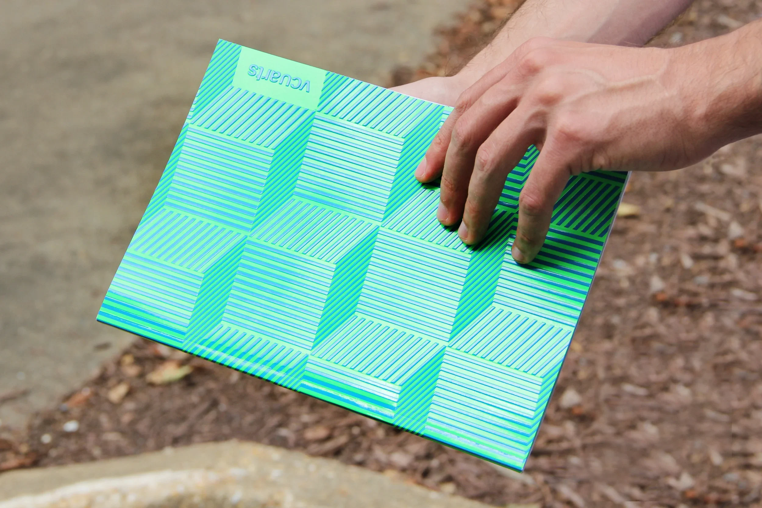


Outcome
The optical illusion created through lines came to life in print with embossing, adding a tactile dimension that invited the audience to run their fingers across the surface and physically engage with the design. Neon green (PANTONE® 802 C) and special blue (PANTONE® 2727 C) pushed the colors into high contrast, while spot UV applied a high-gloss coating to selected areas of the design. Together, these choices gave the cover an energy that seemed to vibrate off the page, transforming a flat surface into a multi-sensory experience.