CRAFT
Craft Brand Refresh
Objective
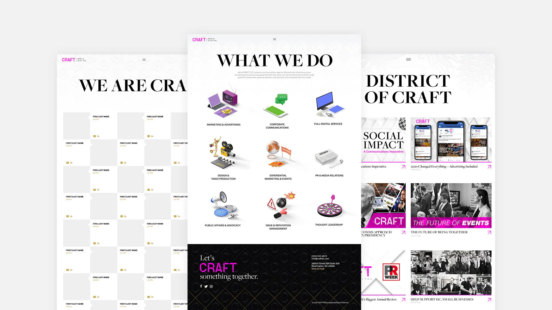
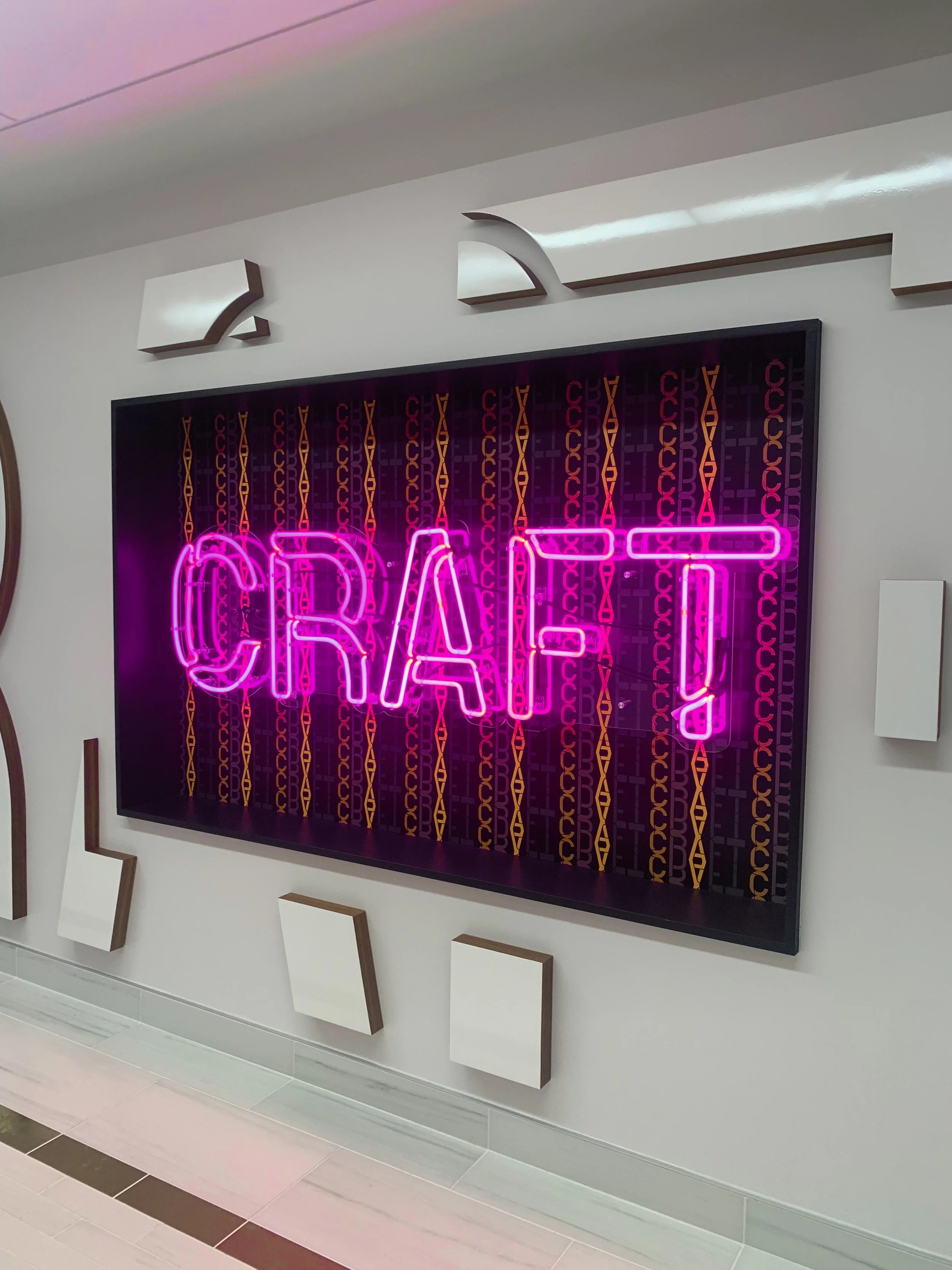
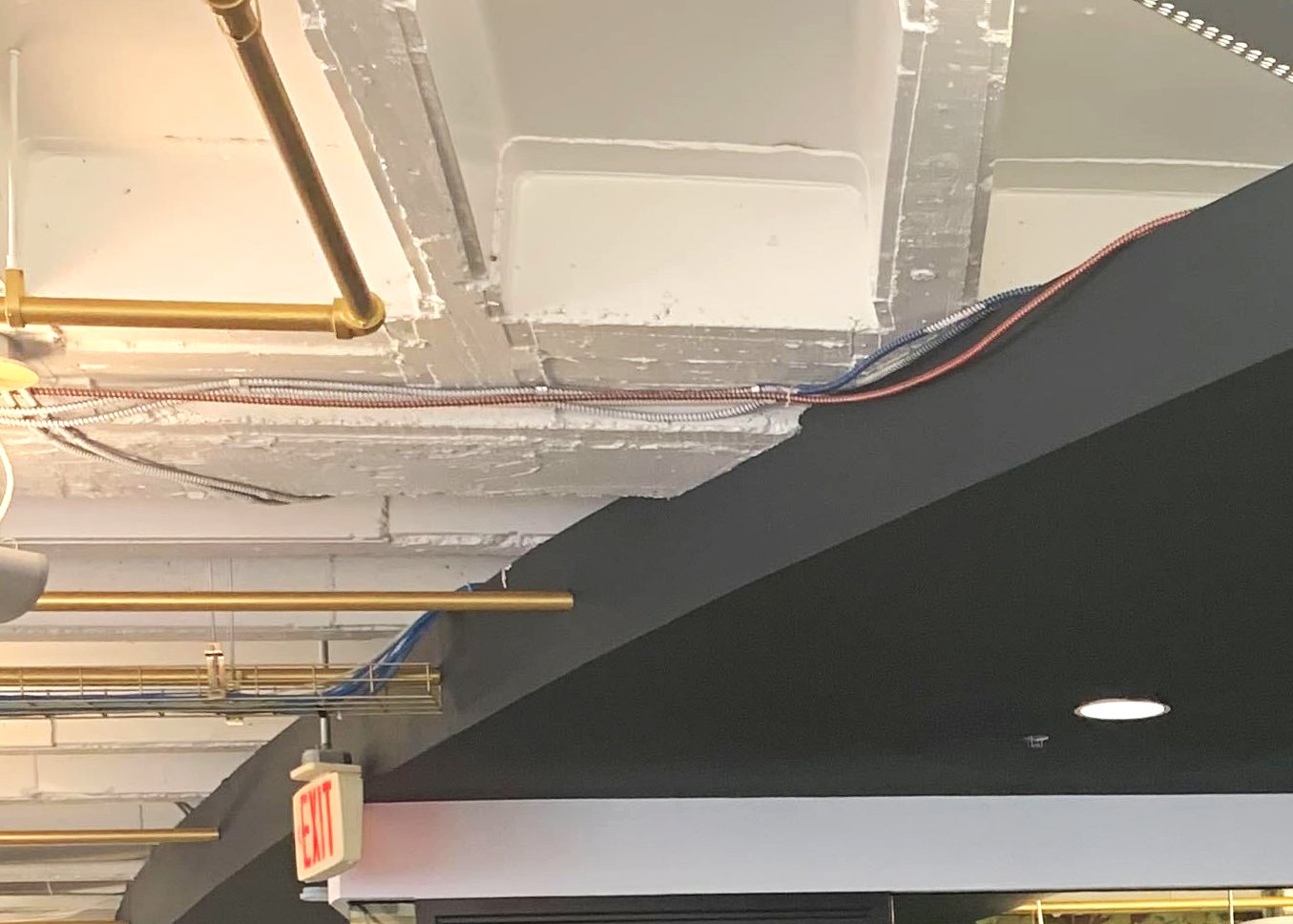
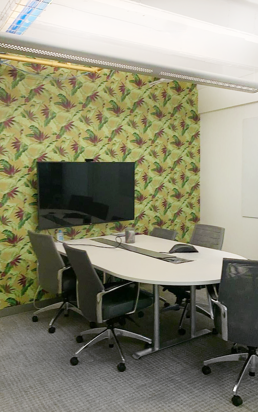
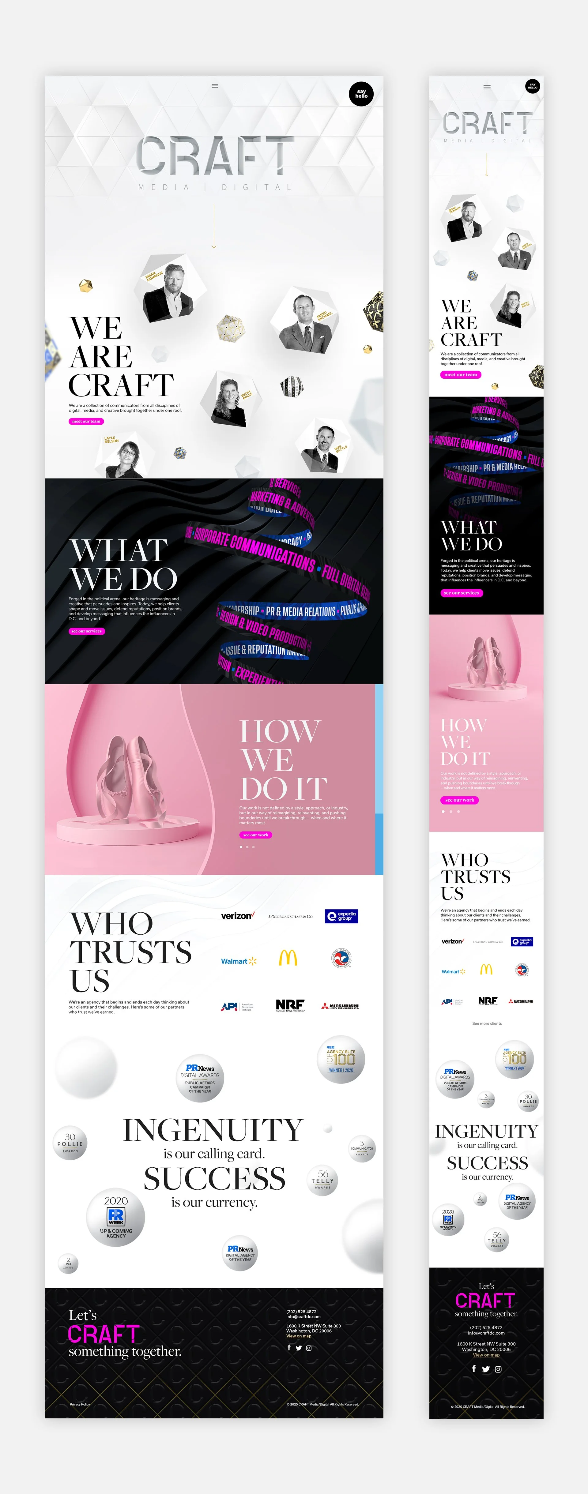
CRAFT is a mid-size digital media agency in Washington, DC. In 2020, the office was renovated to better reflect the agency’s identity and create a space where clients could connect with its character. That transformation led to a website redesign to echo the same materials, textures, wallpapers, and personality of the physical space.
Roles
Design Lead
Conceptualization
Branding
Animation
UI/UX
Deliverables
Design System
Website Redesign
Timeframe
24 weeks
Oct 2020 – Apr 2021
Launched June 2021
Concept
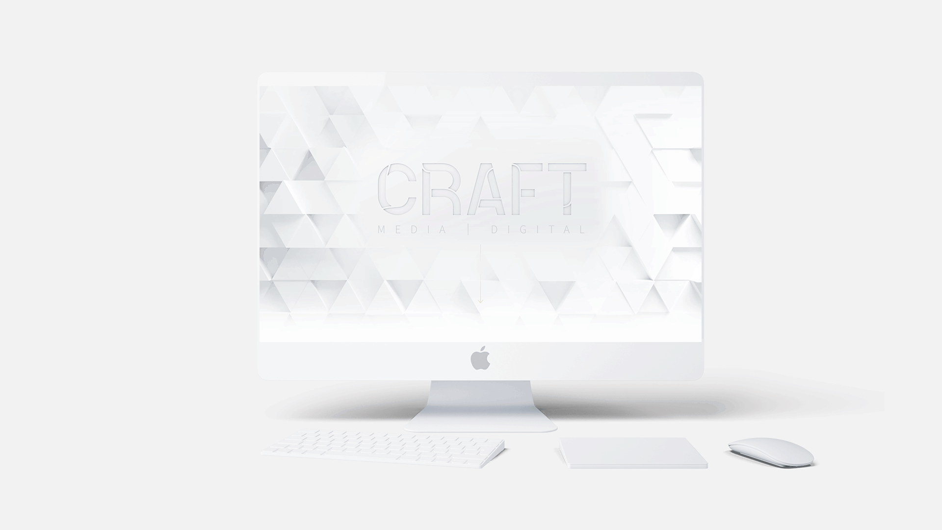
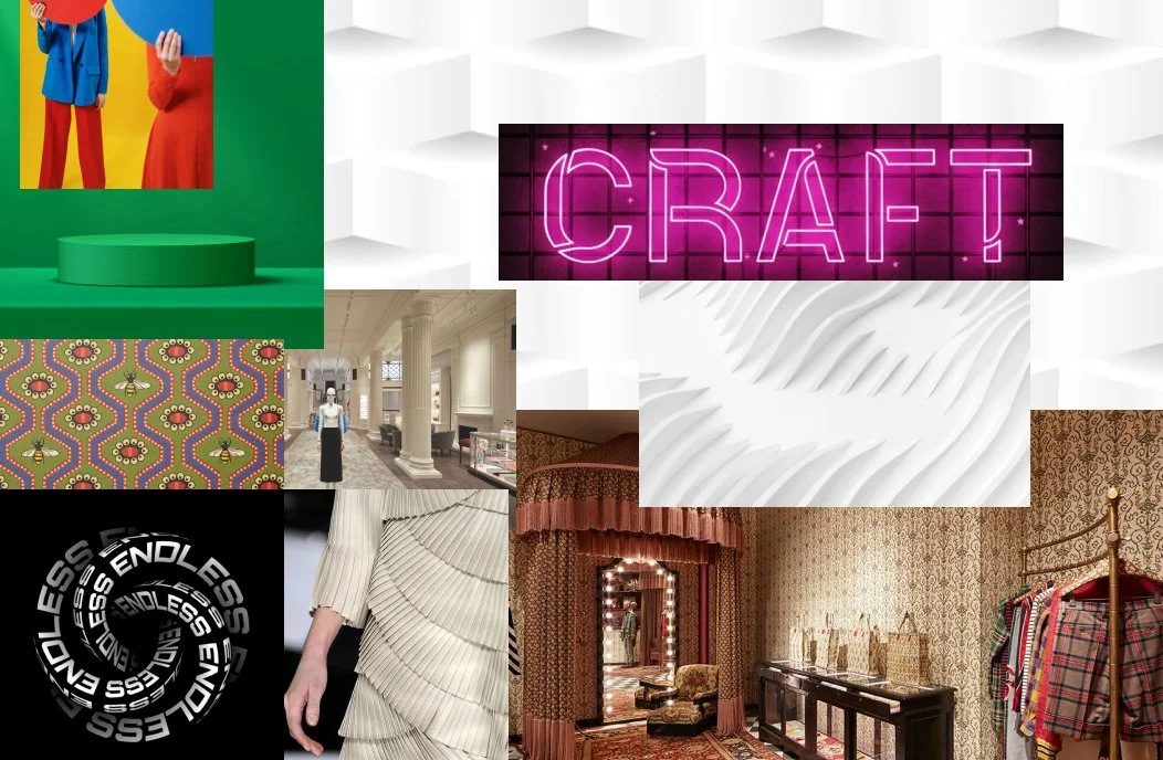
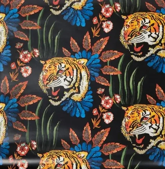
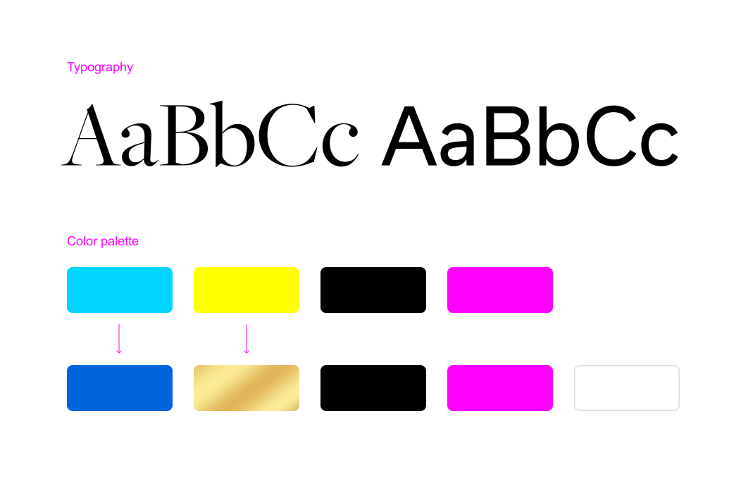
Eccentric maximalism is the main concept of the CRAFT website rebrand, inspired by the mix use of materials for the office renovation; white walls, patterned wallpaper, golden pipes, and a black ceiling, while still holding onto the brand’s legacy pink. For typography, a mix of serif and sans serif also carries this layered approach to the design. This playful, idiosyncratic approach shaped the entire process. The goal was for the website to reflect the same experience visitors have when they walk into the CRAFT office.
Process
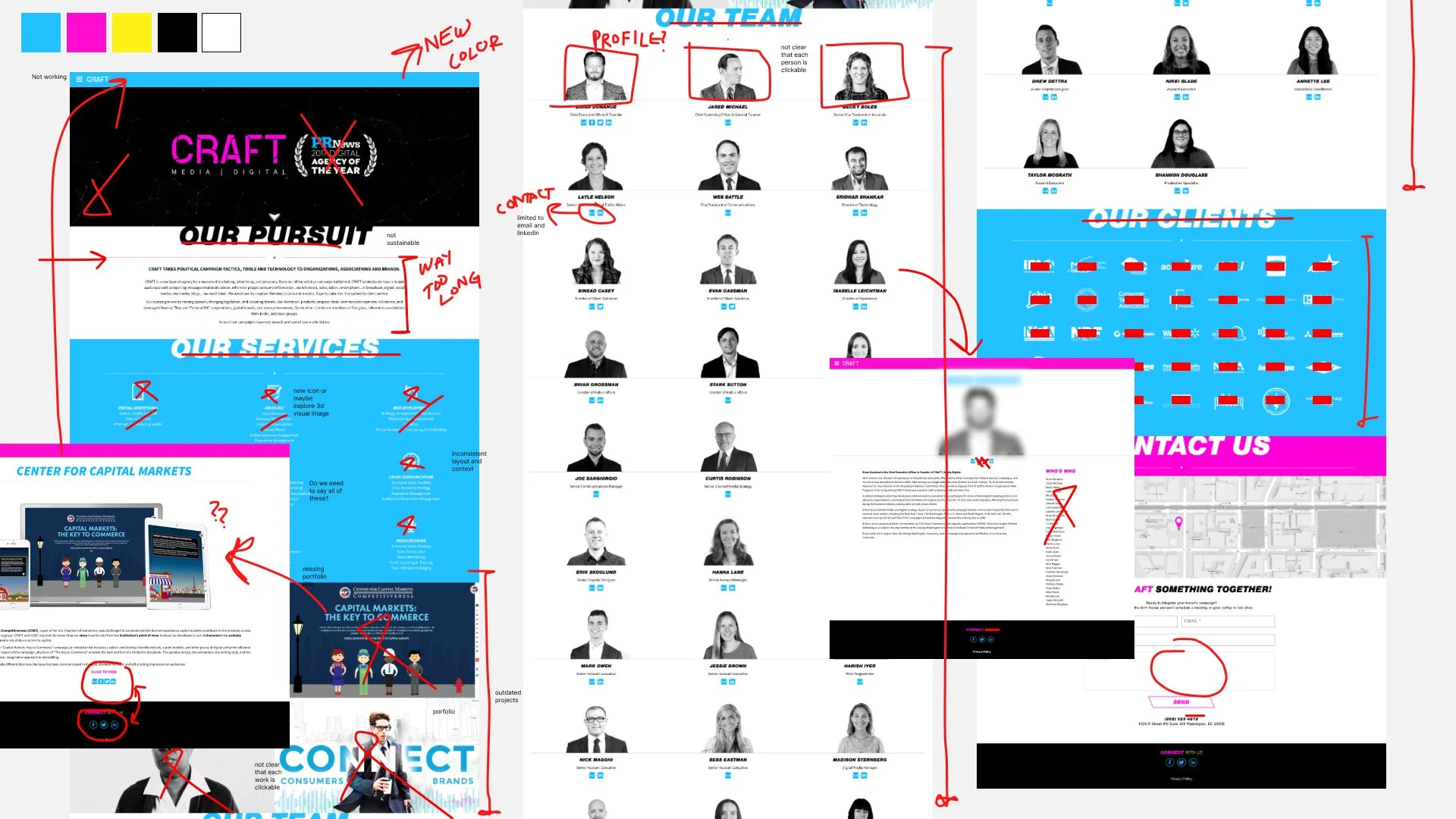
Started off by auditing the previous site, which lacked visual hierarchy, overloaded content onto a single page, and left many subpages overlooked. Navigation was unclear, making it difficult for visitors to explore and learn about the agency. The website also needed a new mapping to organize information to guide visitors and showcase the agency.
Refresh the brand
The original CMYK palette has been enhanced to support a bold, maximalist identity. Cyan has evolved into a deep, commanding blue, while yellow transforms into a rich, luminous gold. White is introduced as a primary color alongside Black, providing a versatile and striking foundation. Blue, gold, and magenta serve as secondary or accent colors, adding layered depth and visual energy to the brand. Typography introduces a Serif family to pair with the existing Sans Serif, creating a dynamic interplay between elegance and modernity that reinforces the brand’s maximalist expression.
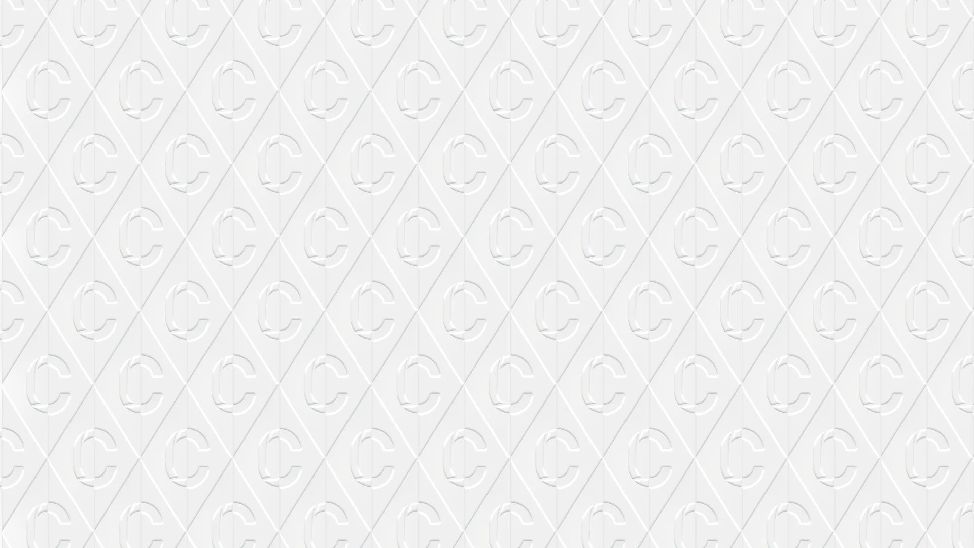
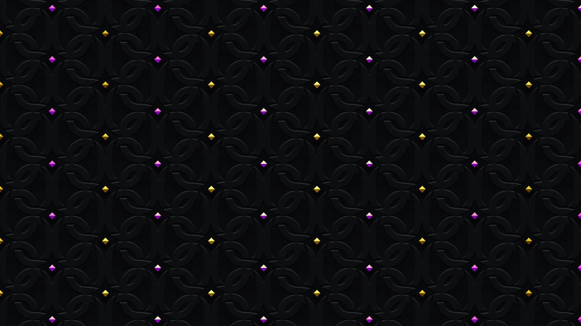
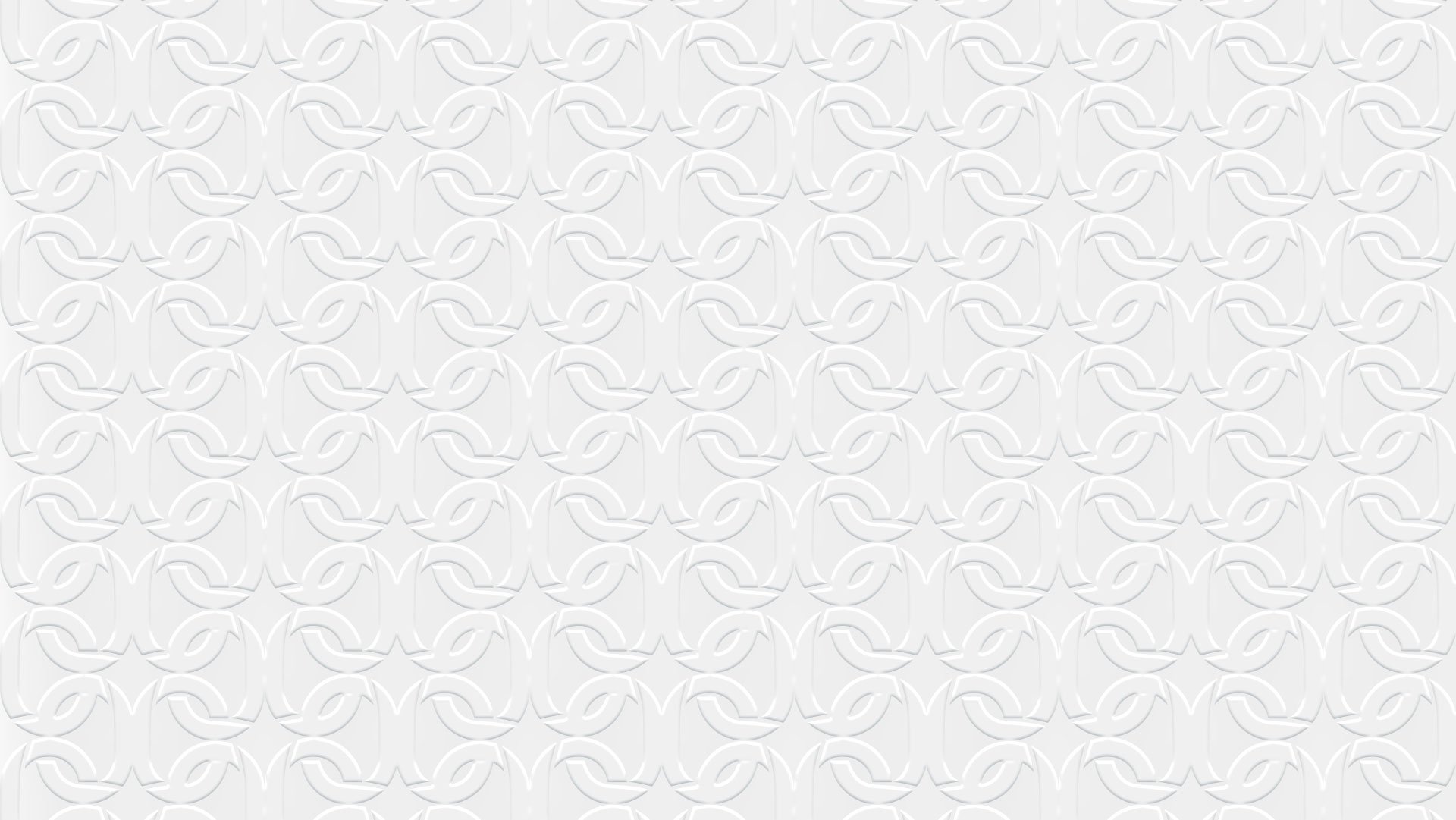
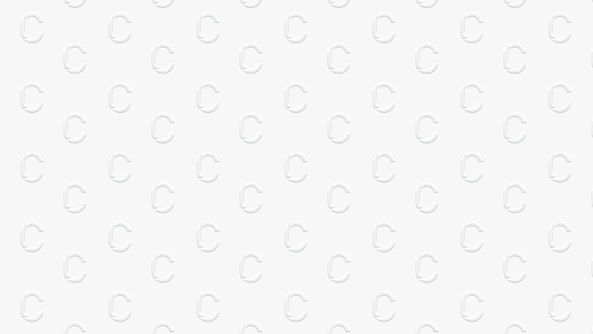

Customized digital wallpapers
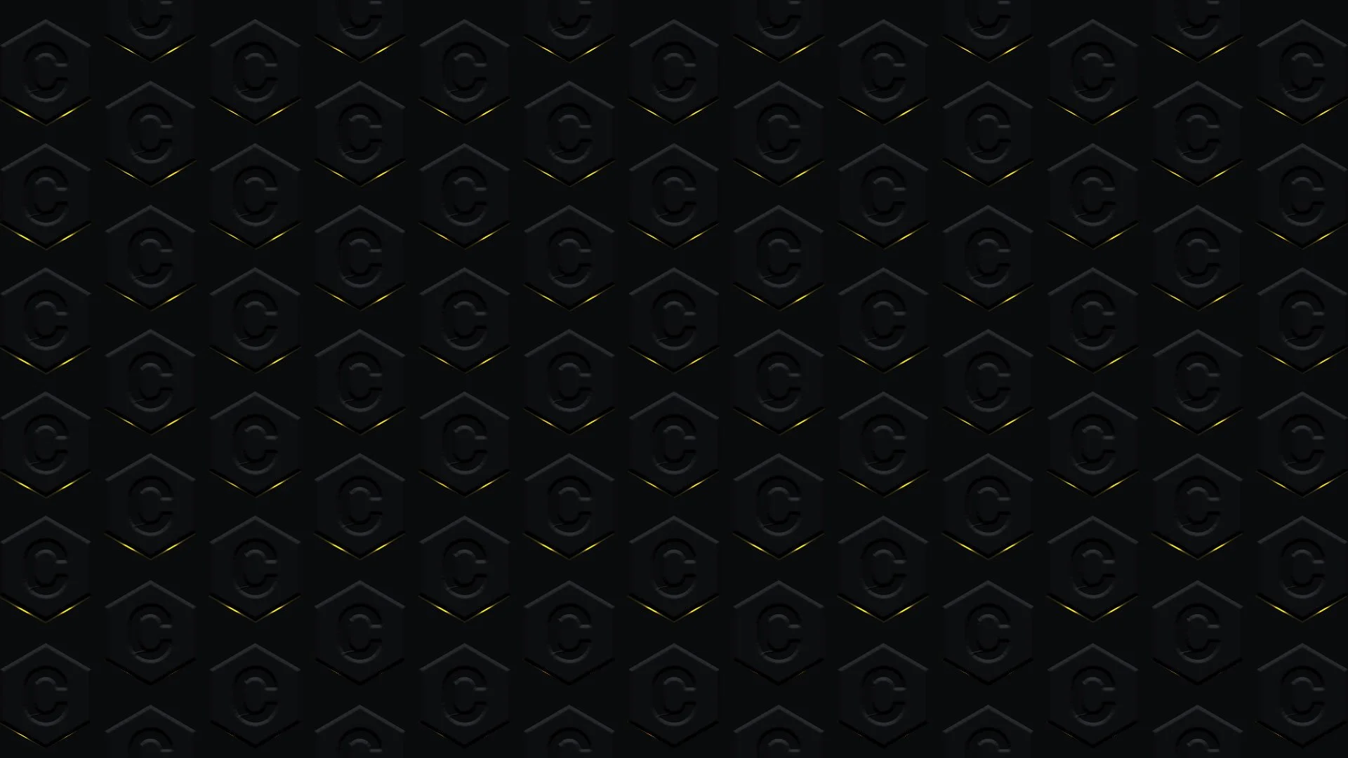
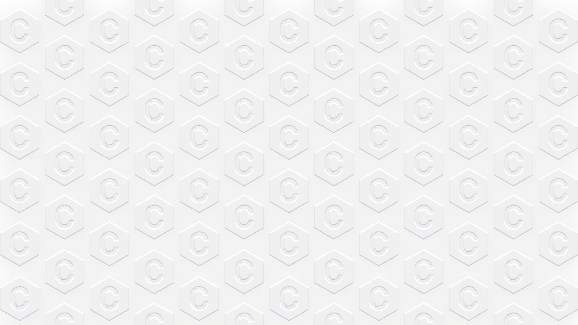
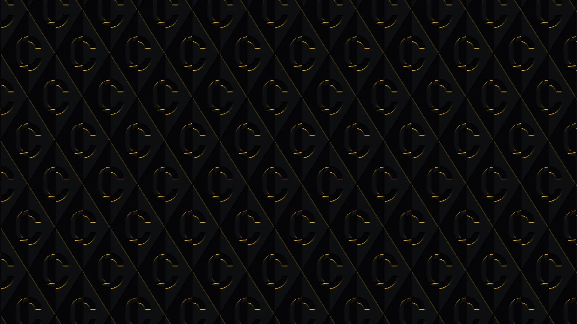
The renovation materials could be translated into anything and it could be as easy as white wall equals white background or black ceiling equals black navigation bar, etc. But wallpaper? Customizing digital wallpapers was the funnest process. The letter “C” of agency’s logo was used to build variety of classic yet funky patterned wallpaper to use throughout the website.
Outcome
While maximalism was the heart of design, the most important thing for the update was a clear navigation and communication. The redesign strengthened user engagement YoY; bounce rate reduced from 70% to ~60%, average session duration increased from ~1:20 to 1:40, engagement rate increased from ~30% to 55%, and conversion rate (contact inquiries) grew 3%. This indicates a strong performance for an independent agency website and a signal of more intentional, high-quality visits.