UVIMCO rebranding
Client: University of Virginia Investment Management Company
Agency: CRAFT | Media Digital
Launched
Phase 1 - December 2021
Phase 2 - January 2022 (Website)
Deliverables:
Website redesign
Printed & Digital Annual Report, Printed One Pager
PowerPoint Template, Word Template
Logo redesign
Durations
16 weeks (Phase 1+2)
Team:
Creative Direction: Sinead Casey
Art Direction & Design Lead: Tara Pairoj-Boriboon
Logo Redesign: Sarah Fierle
Project Management: Taylor McGrath, Jennifer Daniel, Avni Khera
Developer: Sridhar Shankar, Harish Iyer
My Roles:
Art Direction
Branding + Concept
Design Research
UI/UX Design
Wireframing
Prototyping
Usability Testing
Overview
University of Virginia Investment Management Company (UVIMCO) is located in the heart of Charlottesville, Virginia. UVIMCO’s dynamic team shares a passion for investing and serving the University of Virginia. UVIMCO provides investment management services to the University of Virginia and associated organizations to serve the University’s mission.
Phase 1: Collateral Rebrand
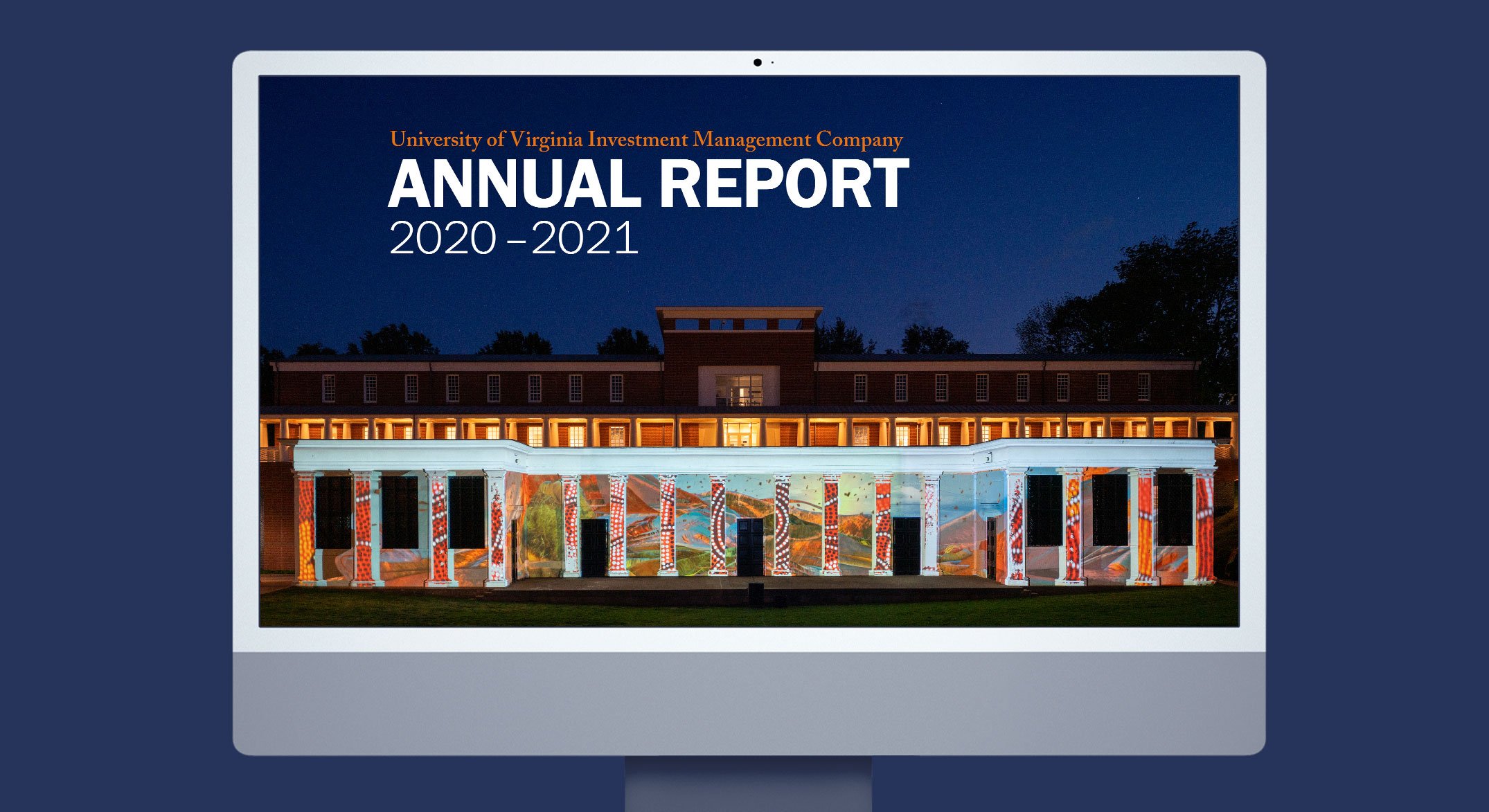
UVIMCO would like to refresh and elevate their brand starting with launching a new look of an Annual Report 2020-2021. The design concept has evolved from the academic heart architecture or known as “Rotunda” from their logo mimicking the front columns of the architecture. The column grid has been decided meaningfully to be three simple lines to represent the community of (1) students, (2) faculty and (3) staff. The length is infinite improvising the flow forward-moving mission and the lifelong process of knowledge among the community.
After the Annual Report 2020-21 released, the concept has been incorporated throughout UVIMCO materials such as One Pager, PowerPoint template, Word template, Social Media graphics and Website.
Phase 2: UVIMCO Website Redesign
Problem
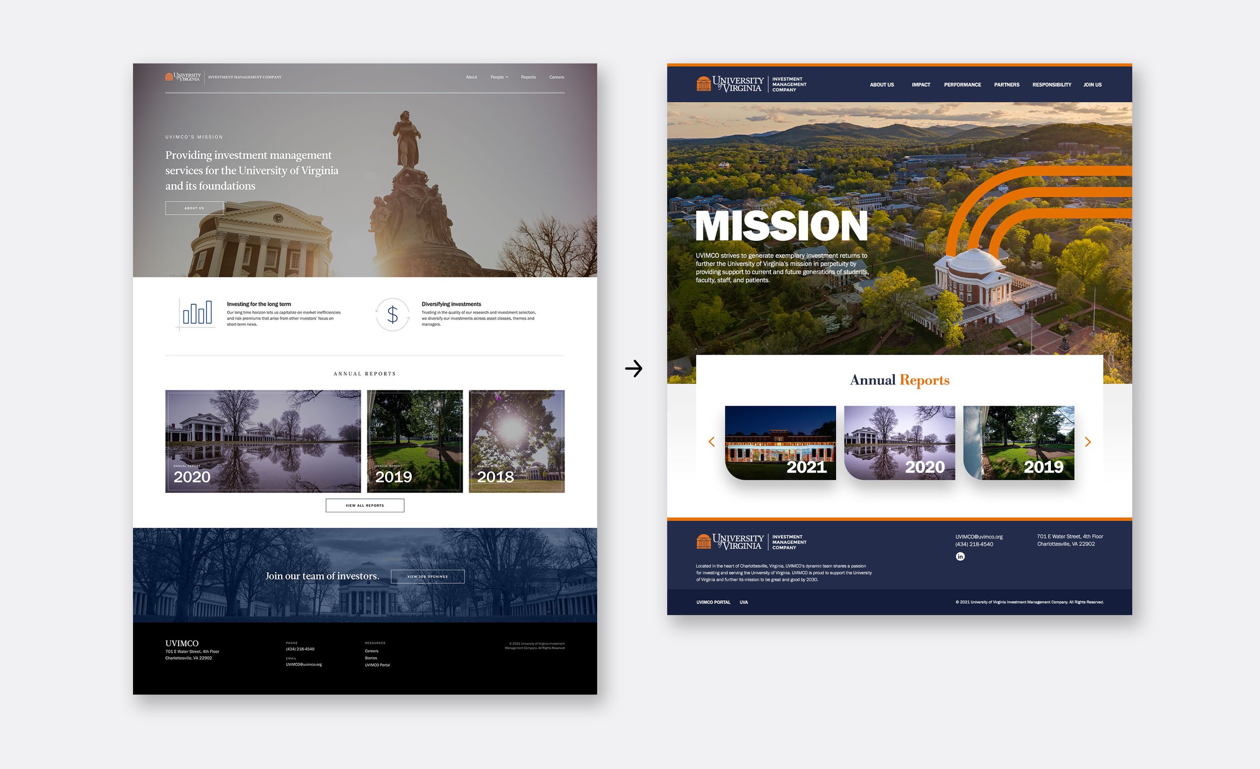
UVIMCO falls under UVA (University of Virginia) and they both carry the same branding. However, the UVIMCO website lacked this brand visuality and seemed disconnected from the UVA website. The site also lacked hierarchy and didn’t have good contrast to guide audiences’ attention.
Solutions
Even though UVIMCO is a management company for UVA, they expect to elevate their site and to give audiences the opportunity to learn more about UVA students’ culture and success, and how UVIMCO’s support makes UVA a great community for staff, faculty and students.
We incorporate more contrast which influences the hierarchy of the content both visuals and texts. This brings more attention to the audience. We use their brand blue heavily to communicate strength, leadership and history. This builds a visual brand connection between UVA and UVIMCO.
See final version of UVIMCO.org


